The data scientist's dream: A curated visual data experience
Today, I was in the data scientists dream visiting the exhibition “Catalonia: 7,5 millions of future”. It was my first time seeing numbers and plots of public data in a curated experience.
They’ve created interactive and animated diagrams of the numbers that represent Catalonia. From the most common names to healthcare advancements, or gender salary breach to rise of unemployment in the past years.

100 most popular catalan names (Winner is "Marc")
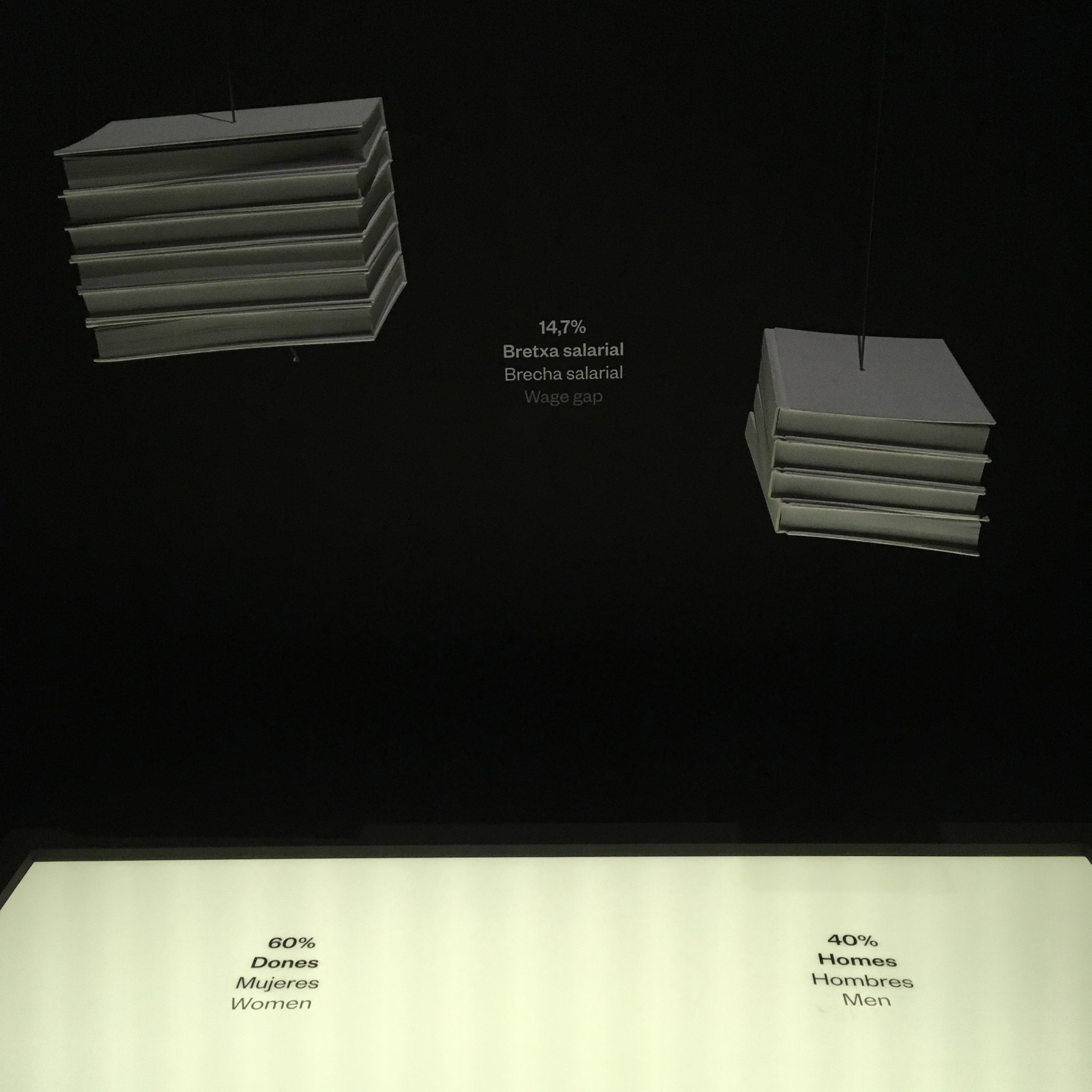
Gender salary breach
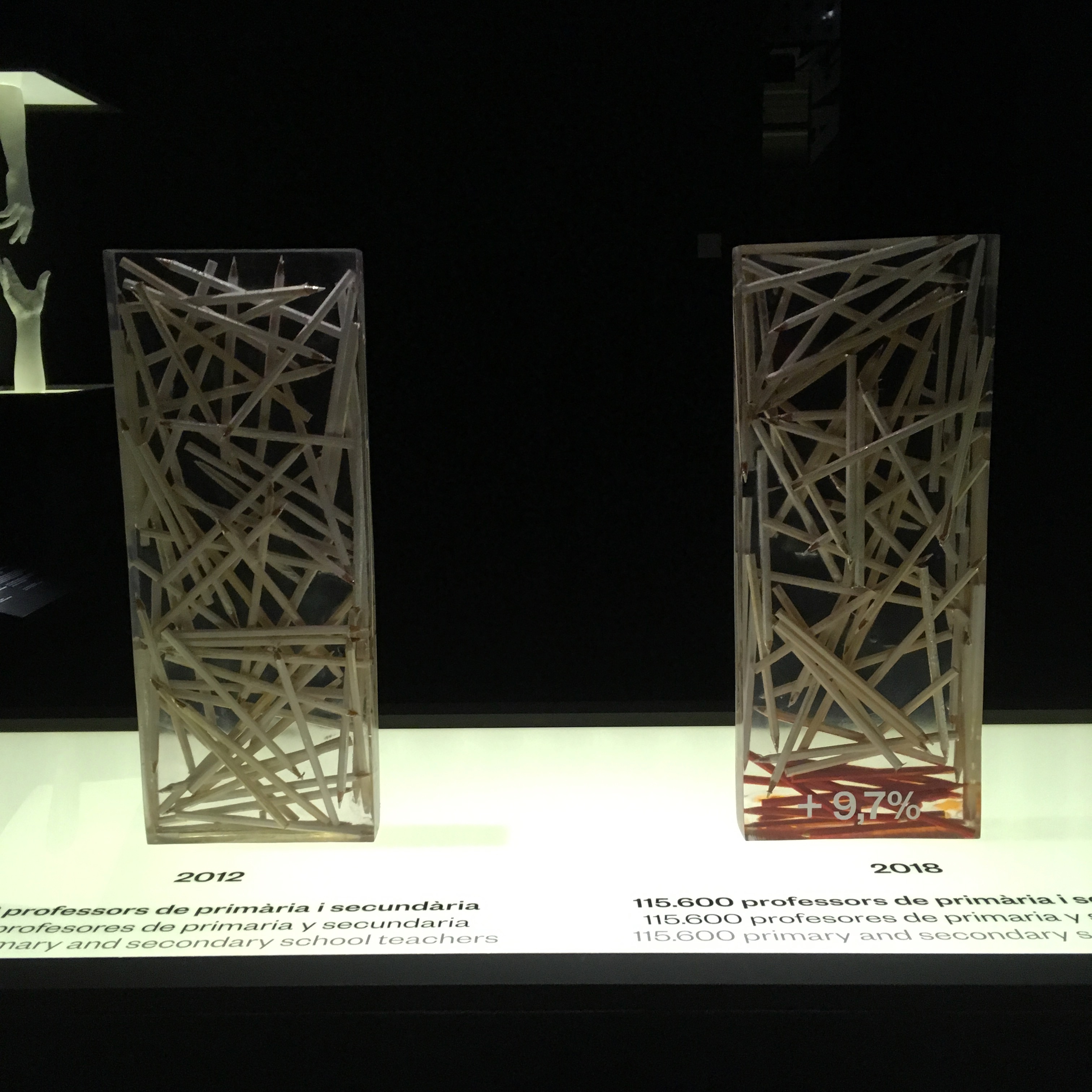
Rise in teachers of primary and secondary education

A bar chart made of suitcases representing the countries that Catalonia takes most visitors from.
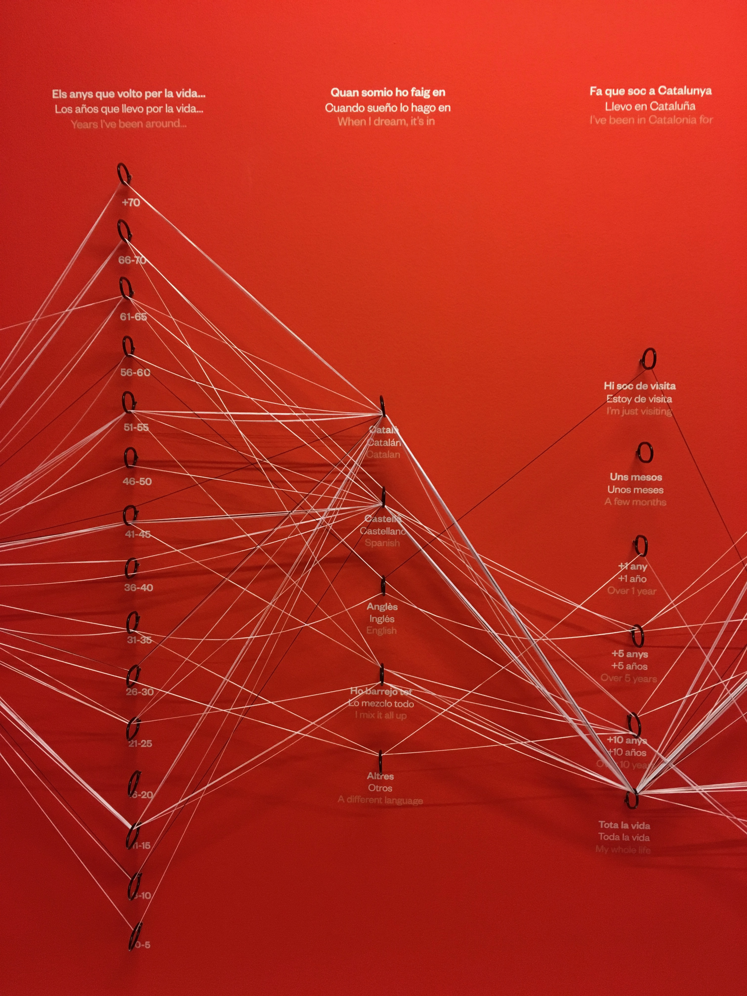
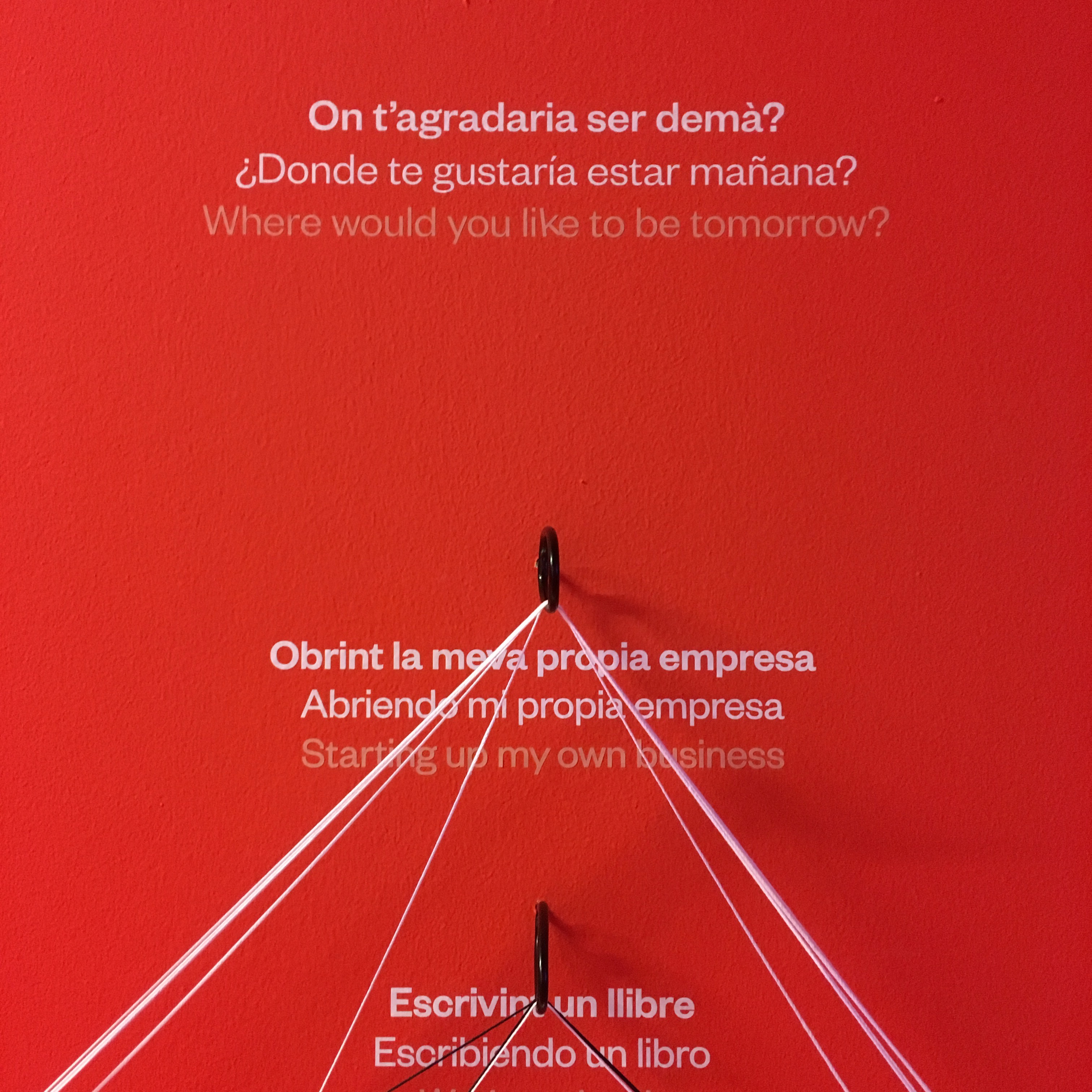
My favorite was definitely the alluvial flow diagram where they let the visitors fill in the data themselves. I was surprised to see how many people out there had a positive outlook for the future. They are the ones who drag the white strings around.
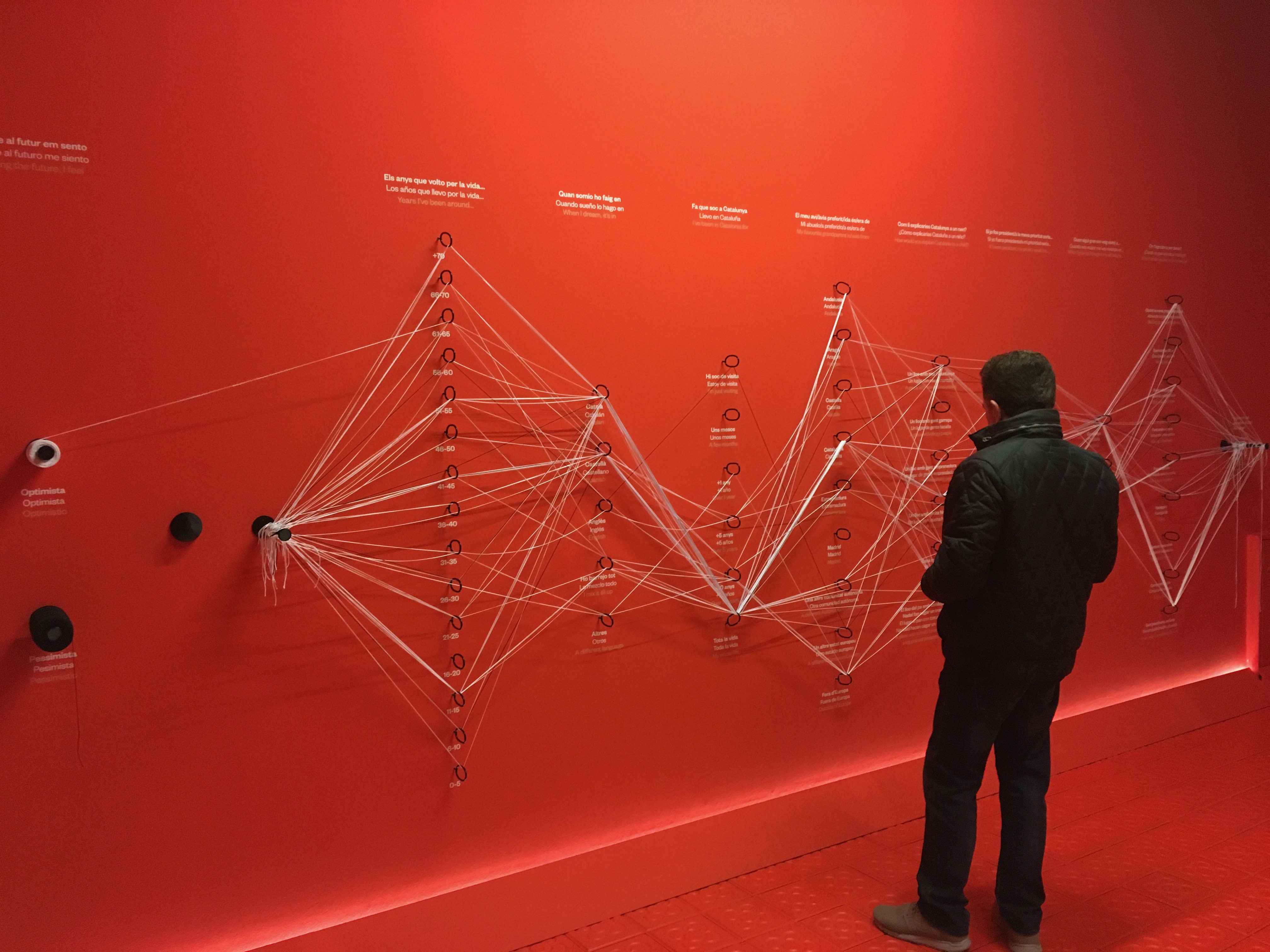
Filling in data with strings